01
Percentage
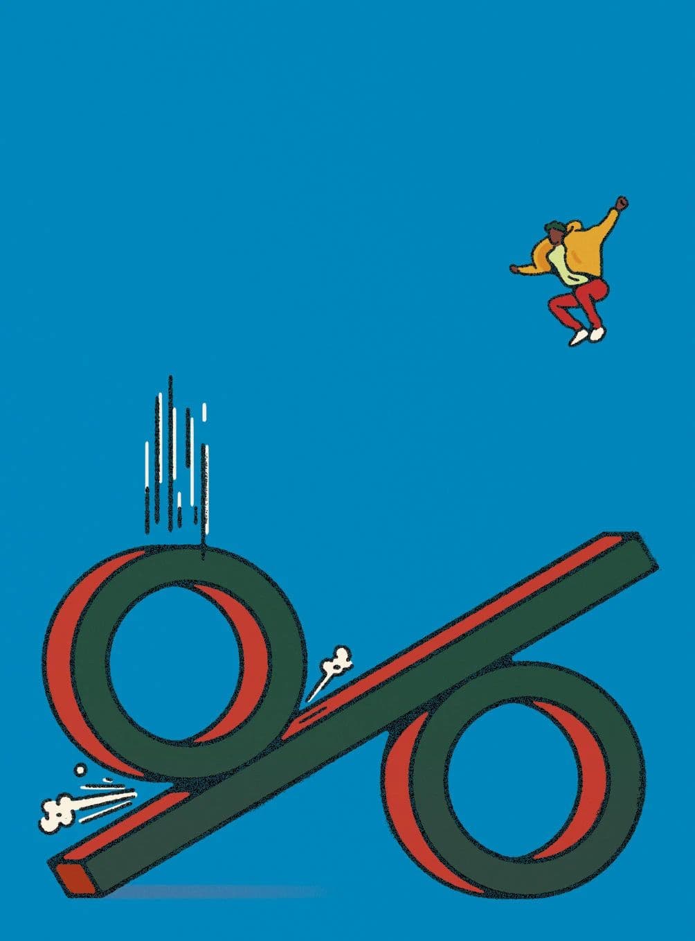
Alberto Miranda turning a percentage sign into a skate ramp. The character launching off with that yellow cape... so good. Love his flat, textured style with bold colors.
Illustration
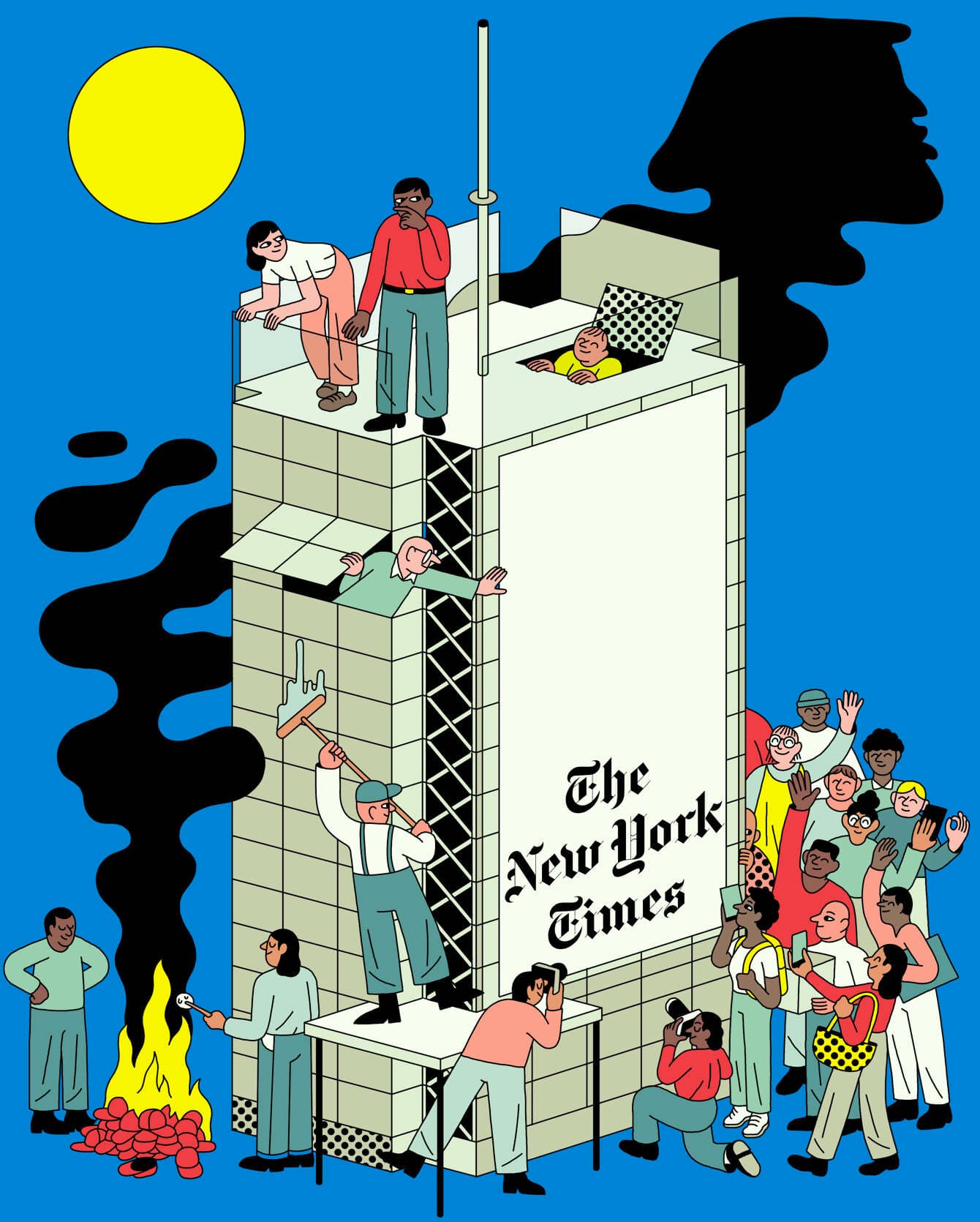
The best editorial illustration doesn't just accompany a story—it tells its own. This collection showcases work from publications like The New Yorker, LA Times, NYT, and Wired, featuring illustrators who've mastered the art of visual metaphor. From Joost Swarte's ligne claire precision to Simon Landrein's playful conceptual work, these pieces demonstrate how a single image can capture complex ideas with wit, style, and undeniable visual impact.
Alberto Miranda turning a percentage sign into a skate ramp. The character launching off with that yellow cape... so good. Love his flat, textured style with bold colors.

by Joost Swarte
Joost Swarte coined the term ligne claire. This 2018 New Yorker cover shows a guy in his cramped apartment workspace—jacket hung up, money tree by the desk, basketball hoop through the cabinet door. All those domestic details. The isometric perspective gives it architectural precision while still feeling warm and lived-in.
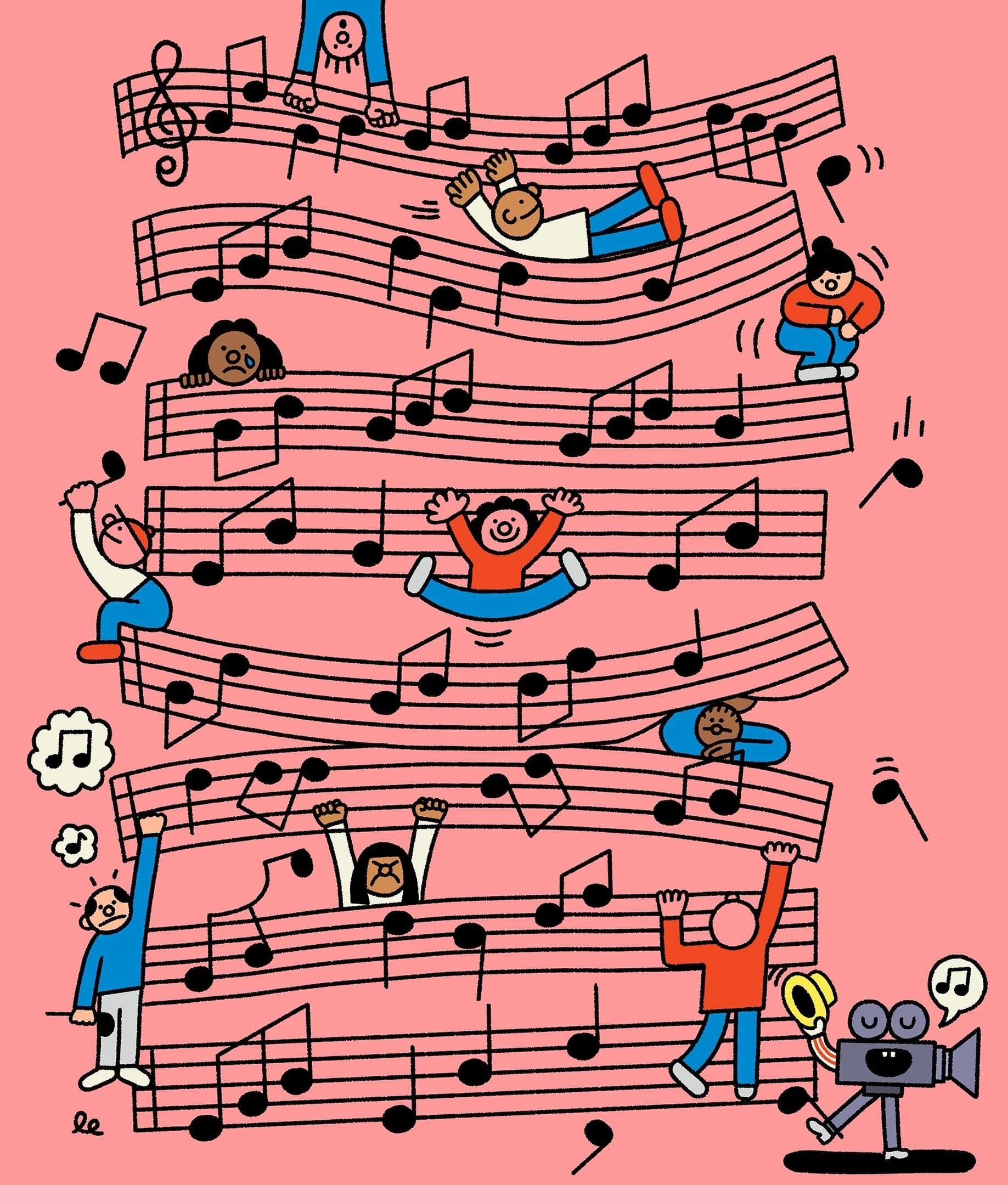
by Leon Edler
Leon Edler's editorial work has this incredible playfulness where musical notation becomes a jungle gym for diverse characters. People lounging on treble clefs, climbing through staff lines, filming with cameras... it's chaotic but so perfectly composed. That salmon pink background grounds all that black ink work beautifully. The guy's won basically every illustration award there is, and you can see why—complex ideas made instantly legible through clever visual metaphor.
Simon Landrein's editorial work for NYT M Magazine has that French illustration sophistication. Bold colors, stylized characters, a confidence in shape and form. The way he reduces complex scenes to these essential graphic elements... it's deceptively simple looking. Editorial illustration that earns its real estate on the page.
by WIRED Japan
Japanese editorial web design just operates on a different level. WIRED Japan's Common Ground Challenge page has that perfect balance of generous whitespace, thoughtful typography, and playful illustrations. The bilingual layout never feels cluttered. It's clean without being sterile, modern without losing warmth. Western tech publications could learn a lot from this restraint.
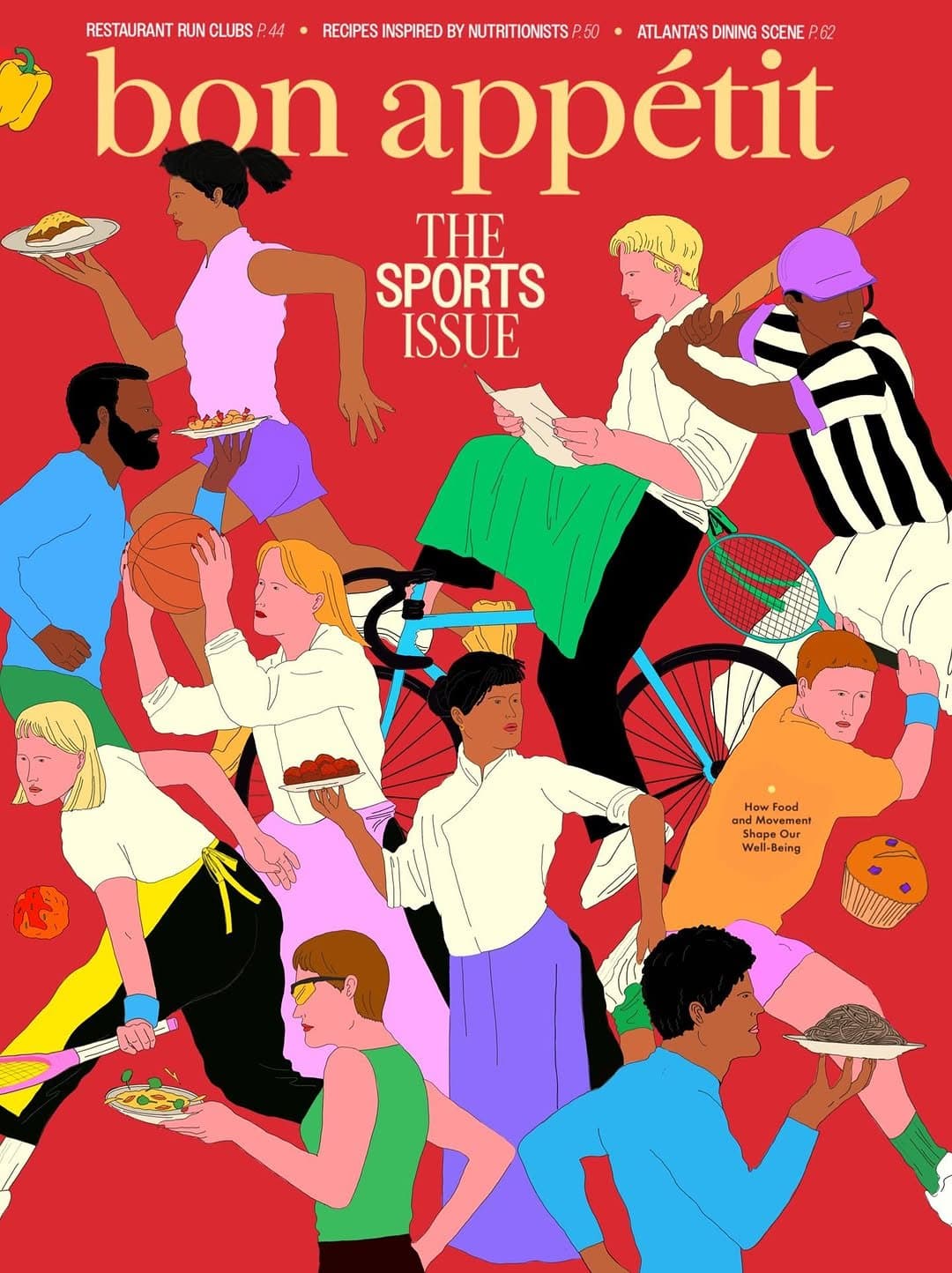
Kimberly Elliott absolutely killed this cover. The dynamic composition, the way food and athletes interweave... someone mid-swing with a tennis racket while another holds a baguette like a relay baton. It shouldn't work but it totally does. That red background anchoring all the chaos. Editorial illustration at its finest.

Albert Tercero's editorial work has this incredible ability to distill complex ideas into striking visual moments. The composition, the unexpected color choices, the way negative space becomes part of the story... it's the kind of illustration that makes you stop scrolling and actually think. Editorial illustration done right.
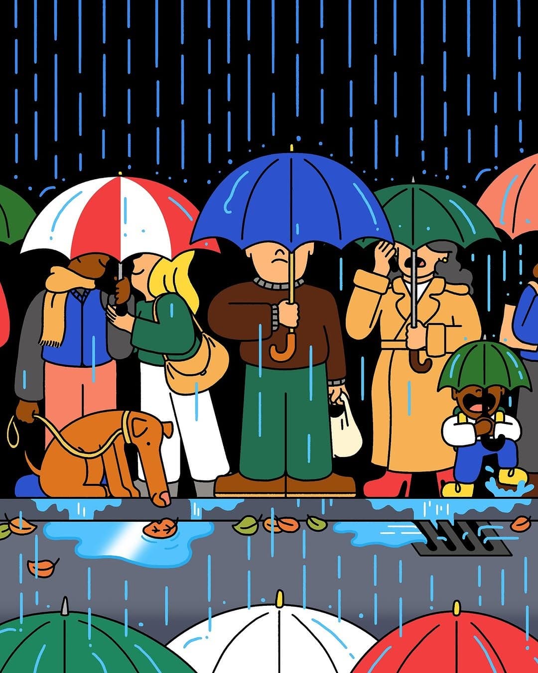
Elliot Kruszynski's use of bold outlines and flat color is so satisfying... but what really gets me here is the reflection in the puddles. That little detail elevates the whole piece. You can almost hear the rain, feel the wet pavement. There's a whole world of stories happening under those umbrellas.