01
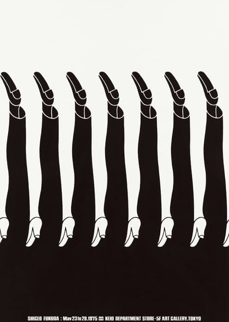
Legs Exhibition Poster
Shigeo Fukuda was a master of optical illusion. This 1975 exhibition poster—the legs flip between pointing up and down depending on how you look at them, high heels creating a mesmerizing rhythm. Black and white, no gimmicks, just visual wit executed perfectly. One of the greats of Japanese graphic design.
Poster