Erly Skincare Identity
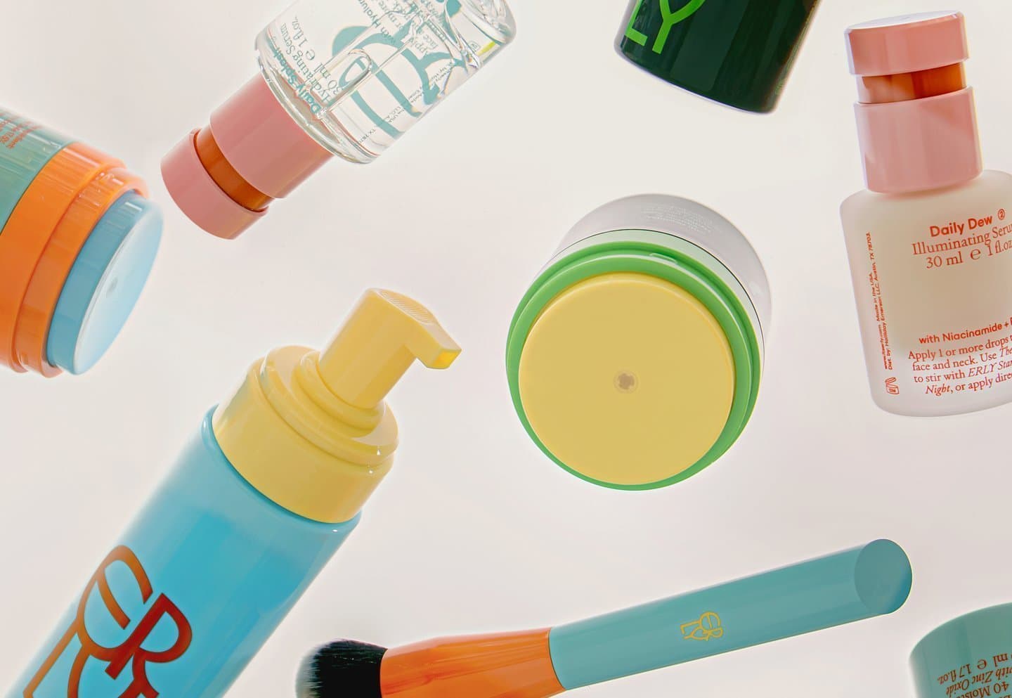
Lotta Nieminen for Erly skincare... the logo has these overlapping letters that feel like they're blending together, which is kinda perfect for a skincare brand. The muted-but-not-boring color palette is really nice.
Lotta Nieminen for Erly skincare... the logo has these overlapping letters that feel like they're blending together, which is kinda perfect for a skincare brand. The muted-but-not-boring color palette is really nice.